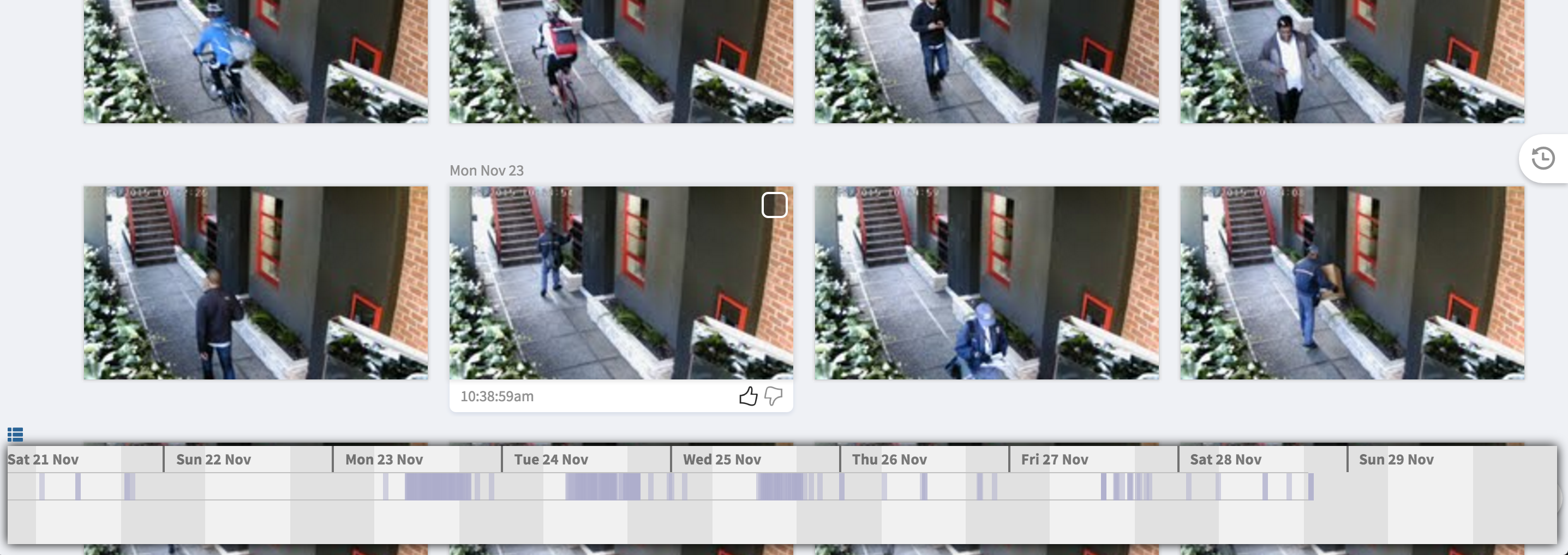
If you're a retailer, for example, that wants to see daily patterns in the frequency of people approaching your front entrance, you can
- search [people approaching entrance] and then click the chart icon in the lower left of your desktop browser:

As you scroll to fetch additional search results, the chart expands the x-axis time range to be inclusive of all the search results. - To zoom-in into a particular time span, click-and-drag from the earliest time to the latest time. For example drag from 5am to 8pm:

To zoom-out, click once to return to the timeline that's inclusive of all fetched search results. - When your search includes multiple query terms, you'll see multiple charts to convey the frequency of each distinct term as in [west people cars]:

NOTE: The frequency charts work with any search that's specific enough to be plotted on a single screen. So if you have have many cameras, you may need to include only one or two cameras in the search.
Comments